


 (1).png)
.png)
.png)
.png)
.png)
 (1).png)
.png)

 (1).png)
.png)
.png)
.png)
.png)
.png)


.png)
.png)


.png)


.png)
.png)
.png)
.png)


.png)


.png)
.png)
.png)
.png)
.png)
.png)
.png)


.png)


.png)
.png)


.png)


.png)

.png)


Tips for packaging design
.jpg)
PACKAGING DESIGN: A WHOLE PACKAGE
Packaging plays an important role in the purchase decision. After all, it is the first aspect that catches the eye when looking for a product. It often takes a split second to decide whether the customer will take a closer look at the product and consider making a purchase. It is therefore all the more important that the design is effective and convincing. But what exactly makes good packaging design?
Above all, the whole package has to be right. The packaging should make a good impression both visually and haptically and meet the taste of your target group(s). You should also include your corporate design. Packaging is a brand ambassador - so think carefully about how you want to present yourself with your product and packaging design.
In addition to these general requirements, we have a few useful practical tips for you to guide you in your design work with fonts, colors and images.
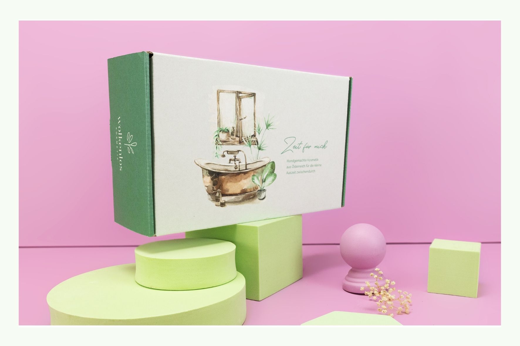
COLORS: IT'S ALL ABOUT HARMONY
Standing out is essential - and colors are an effective way to do just that. However, that doesn't mean that signal colors are always a good choice. Packaging that is flashy and brightly colored catches the eye, but quickly appears unpleasant. It is therefore often better to use signal colors only for targeted highlights.
It is more important to achieve a harmonious effect. So make sure that the colors do not "bite" each other. However, colors and tones that create contrasts are definitely worth considering. This is because it adds excitement to the design - which attracts attention to the product. So it's a balancing act.
Basically, it's always good to draw inspiration from your product and brand. Because colors express moods and feelings that you want to associate or not associate with your product.
- Natural and decent colors have a calming effect, for example.
- Warm and bright colors, on the other hand, are uplifting and cheerful.
- Cool or dark tones have a particularly noble effect.

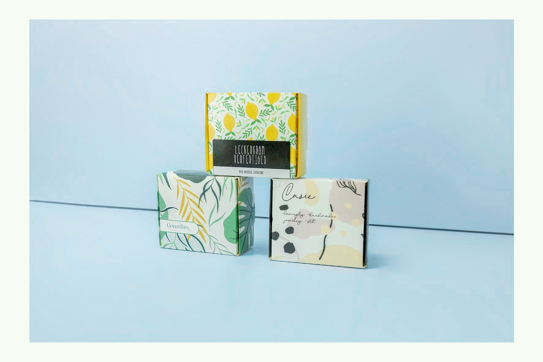
PATTERN: JUST NOT TOO INTRUSIVE
Similar to colors, patterns have a strong visual impact that you can use to attract attention. However, patterns on product packaging should not be too intrusive.
Otherwise, it will distract from important aspects like the brand logo and product name. So make sure that the pattern is visually in the background at least in the right places.
Otherwise, it will distract from important aspects like the brand logo and product name. So make sure that the pattern is visually in the background at least in the right places.
ILLUSTRATIONS: AVOID PIXEL
Product images are particularly useful if the packaging is an opaque Doypack for example, and there is no transparent viewing window. Make sure that the image quality is high. Because visible pixels put the product quality in a bad light.
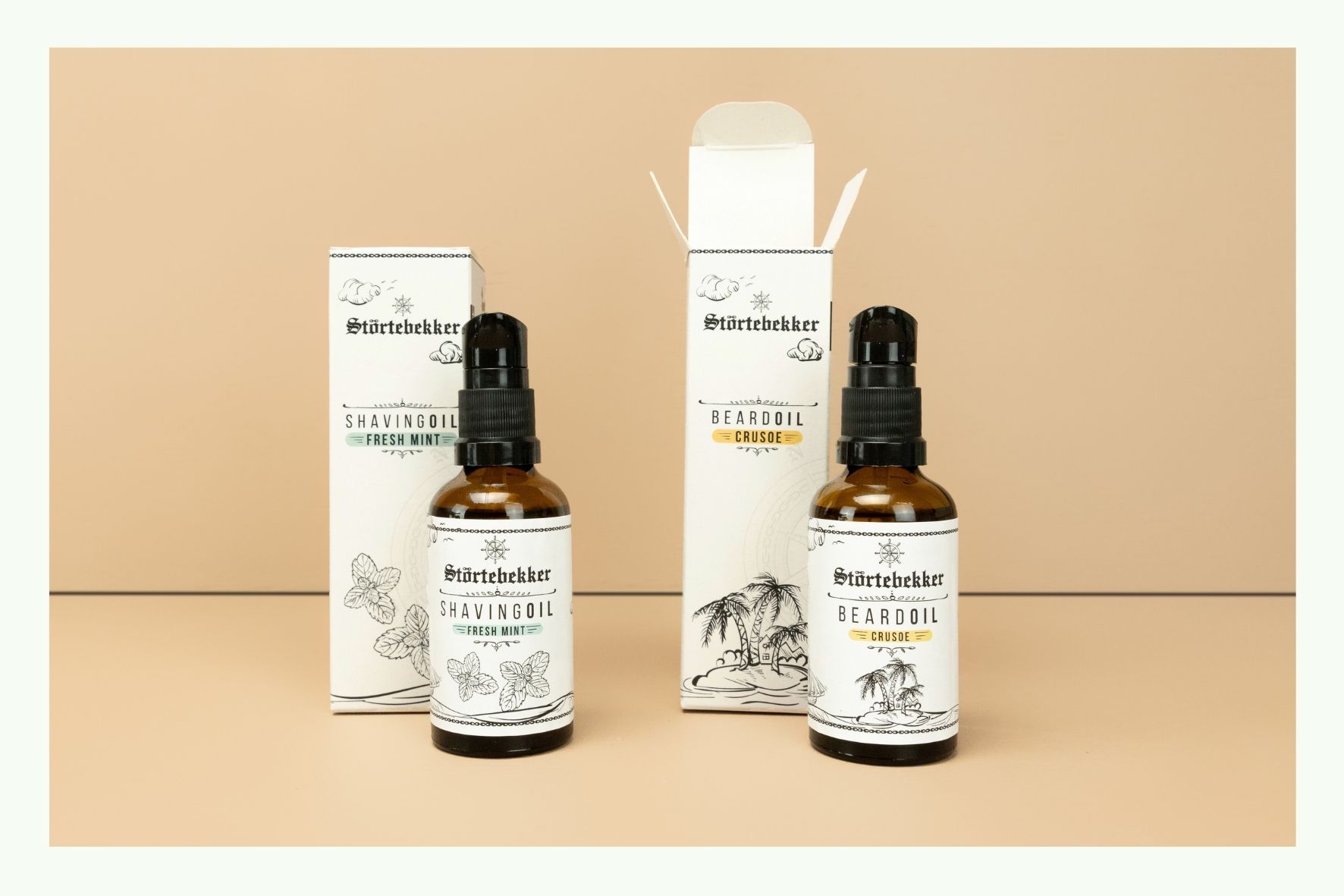
WRITING & TEXT: ORDER MUST BE
Packaging always conveys information about the product it contains. The text should therefore be easy to read. Here are some rules of thumb:
- Simple, straightforward fonts are more readable than ornate fonts.
- If you use multiple fonts, it's important that they harmonize and don't disrupt the overall look.
- Less is more: Too many fonts look chaotic.
- The text should have a certain minimum size.
- Make sure there is enough contrast between the text and the background.
- Spelling mistakes look very unprofessional.
- The text should be neatly aligned.
- Do not position the text too close to the punch line to avoid cutting off the lettering.
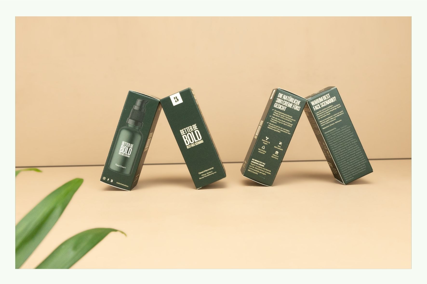
THE LOGO: IN THE FRONT ROW
The logo serves as a recognition feature and helps to quickly assign a product - be it to a manufacturer, an advertisement, a price range or a good experience from the past. Therefore, the logo should always be well proportioned and visible. Ideally, it should be noticed at literally the first glance. For this you should pay attention to sufficient contrast to the background.
REFINEMENTS: FOR THE FINISHING TOUCHES
Find out what options are available for finishing your desired packaging material. There are particularly many options for Besonders viele Optionen bestehen bei folding boxes: Examples include varnishes and laminates that provide a glossy or matte surface, blind embossing or hot foil stamping in silver or gold.
You can also add value to labels or pouch packaging with finishes.
Always keep the target group and the character of your product in mind. If the topic of sustainability is central, finishing using plastic is counterproductive; blind embossing, in which a motive is pressed into the material, however, is an appropriate upgrade.

