When creating
print data, you have to consider many different things. The better you know the production process and the technologies behind it, the easier it is to understand how to create print data. I started working on this topic about 7 years ago and have been creating my own data for a wide variety of print products and packaging ever since. I started with Photoshop, and my first print file was a .jpeg image. Sadly for my colleagues in prepress. Since then, I've improved my skills in this area, but there are still a few things I struggle with today.
Creating print data is therefore not necessarily something for beginners and should only be done by experienced media designers or agencies, especially for packaging.
1. The basics for creating printable data
Whether you want to design a simple flyer or a complex folding box, the required basics are always the same. To make sure nothing goes wrong with your next design, I'll list the most important and common questions you should consider.
Important: Depending on the print shop and product, the following information may vary slightly. Therefore, always pay attention to the specific requirements of your desired print shop.
Which graphics program for my print file?
Print data should be created as vectors. I recommend programs like Adobe Illustrator or Adobe Indesign. Photoshop is based on pixel files and is therefore not recommended (texts, lines and shapes would be printed much blurrier depending on the product and material). Under no circumstances should you create your data in programs like Microsoft word or microsoft power point.
Which data format for my print file?
Print data should always be saved as PDF. I explicitly recommend that you save it as "PDF / X-4:2010". And this is how you save a PDF correctly (in Illustrator):
- 1. "File"
- 2. "Save as"
- 3. Assignment of a clear file name
- 4. Format: "Adobe PDF (pdf)"
- 5. Adobe PDF specification: "High quality print"
- 6. Standard: "PDF/X-4:2010"
- Addition: Select "no recalculation" under Compression.
Please avoid data formats such as ".ai", ".eps", ".svg" or ".psd". These cause a lot of extra work in our prepress department, which often has to be calculated further and causes high time delays. Formats like ".jpeg", ".png", ".doc" or ".ppt" cause an inferior print result. To protect our customers, we do not accept these formats.
Which color space for my print file?
Printing is done in the CMYK (Cyan, Magenta, Yellow, Key) color space. Avoid creating your print data in the RGB color space; this is only suitable for reproducing digital content on your screen. When you open one of our artwork files in Illustrator, the color space is automatically set to CMYK. For a new file, you must manually switch from "RGB color" to "CMYK color" each time. Spot colors can only be simulated in digital printing and are sometimes more and sometimes less true to the original, depending on the spot color and material.
In case of a complex design or some rest insecurity, I recommend a "sample print" for your desired product. In addition, our data experts will be happy to check your print data for possible sources of error. Simply select our "Expert Data Check" when placing your order.
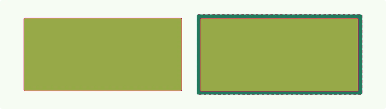
What is a bleed / trim?
Each print product is printed on a sheet or roll in the first production step. In further steps, the product is then either punched or cut. During these processes, slight fluctuations in the punching or cutting accuracy may occur. In this case, if no bleed/trim is created in the document, so-called "flashes" will occur and you will have unsightly edges in the color of the material, depending on the material color. Therefore, create the product-specific bleed in the document for each of your artwork and enlarge the background (colors, patterns,...) of your design accordingly. Here is a simple example of a square roll label in Illustrator
How to create a bleed in your Illustrator document:
- 1. "File"
- 2. "Set up document"
- 3. Bleed: Input of the product-specific required bleed
- 4. Confirm with "OK"
What resolution for my print file?
Images (.jpeg / .png) included in your design need at least 300 dpi for optimal printing results. The abbreviation dpi stands for "dots per inch" and describes the number of dots within 1 inch. The higher this number, the higher the resolution of your images when printed. If the resolution of your images is too low (e.g. 72 dpi), the printed image will be blurred.
What size for texts, lines and contours?
To make text readable in all colors and on all materials, I recommend a minimum size of 6pt. Lines and outlines should be at least 0.5pt thick. If you want to use a smaller font than 6pt. due to lack of space, you should first order an original sample print before the actual order. Depending on the product, you can easily order this online in the corresponding product configurator.
Always remember, reading small texts is very tiring, and some of the more than 27 million pensioners in Germany suffer from age-related visual impairment. So when you test your product prototype, always remember to test it against the broad average of your target audience.
What is the safety distance?
As described above in "What is a bleed/trim?", slight variations occur when cutting or punching your printed products. Just as a lack of bleed can cause flash, too little safety margin towards the edge can cause parts of important text or images in your design to be cut off. I therefore recommend that you place all important elements such as text, characters and images at least 3 mm from the edge.
How do I put on black correctly?
In the CMYK color space, the color black can be created in two different ways. You can create black from all four available colors (e.g. 96% Cyan, 90% Magenta, 89% Yellow and 92% Key). Or simply as 100% key.
The first option has the major disadvantage that the total ink coverage is over 350%, which means that a very thick layer of ink is applied. Especially with fine lines and texts this can lead to the fact that these run and are no longer recognizable. I therefore recommend that you always apply black texts, lines and elements with 100% key (0% cyan, 0% magenta, 0% yellow, 100% key).
2. Product specific features
Depending on the product, there may be specific requirements in addition to those listed above. Especially if special products or special materials are required.
Opaque white / HPI-White
For transparent or colored materials, you will need the "White" printing ink, depending on the requirements for the print result. This ink provides full-surface coverage so that you can no longer see through the material or the material color can shine through the design. In addition, this color can be used to make a transparent film appear white in desired places. We recommend the use of opaque white for the following products:
Transparent roll labels - important texts, logos and elements should be covered with opaque white so that they can be easily recognized and read.
Transparent pouch packaging - important texts, logos and elements should be backed with opaque white so that they can be easily recognized and read. In addition, all areas not covered with opaque white can be used as "viewing windows".
Folding boxes from natural cardboard or grass cardboard - important texts, logos and elements should be backed with opaque white so that the dark material does not shine through them and make them unreadable.
This is how you create the opaque white in your print file:- 1. Duplicate element to be deposited and place it behind the main element
- 2. Create a new color - solid color, 20% cyan, with the name "HPI-White"
- 3. Color the back element with this color
- 4. Set the main element to "overprint" (you can find it under "Window" -> "Attributes")
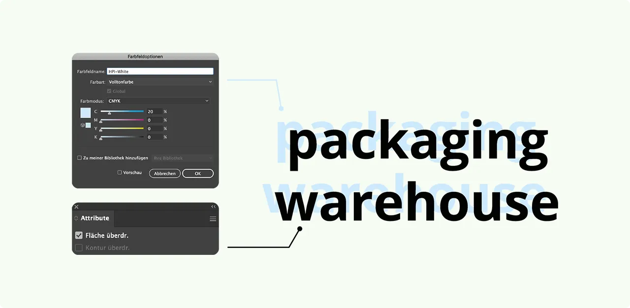 Figure 2: Illustration of the layout of the color "HPI-White / Opaque White" in IllustratorFolding box adhesive tabs:
With
Folding boxes and
shipping boxes it must be noted that these are glued in the final process step via a folding box gluer. Depending on the box or carton type, there are different numbers of gluing areas. A folding box with tuck-in flap, for example, has only one gluing flap. A folding box with a crash lock base, on the other hand, has one gluing tab on the side and two gluing points on the base. To ensure that a folding box can be glued securely at these points, these areas must not be printed. Your design should therefore not cover these areas. These areas are marked in your artwork as followed:
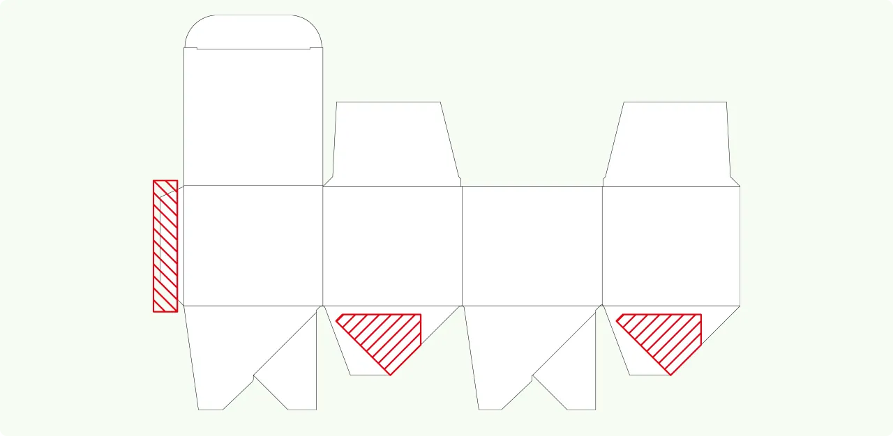 Figure 3: Illustration of the gluing tabs of a folding box print template
I hope that this article has given you a first small but helpful insight into the world of print data. If you want to learn more about this topic, take a look at our
pages on the creation of print data.

 Folding boxes
 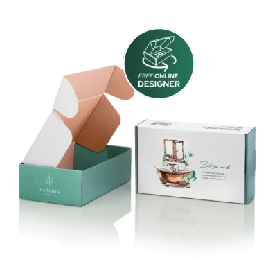 Shipping boxes
 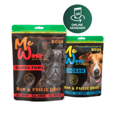 Stand-up pouch
  Flexible packaging
 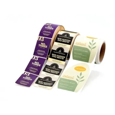 Labels
 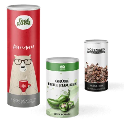 Paper cans
  Sample boxes