


 (1).png)
.png)
.png)
.png)
.png)
 (1).png)
.png)

 (1).png)
.png)
.png)
.png)
.png)
.png)


.png)
.png)


.png)


.png)
.png)
.png)
.png)


.png)


.png)
.png)
.png)
.png)
.png)
.png)
.png)


.png)


.png)
.png)


.png)


.png)

.png)


Typography basics: the font as part of packaging design

It's not just about the small print! Logos, images, shapes and colors on packaging attract most of the attention. They catch the eye, are recognized, arouse emotions.
With so much visual impact, type sometimes takes a back seat in packaging design. Yet it not only takes on important tasks, but is even an integral part of the design.
The right typography for a package is therefore not just about how to fit all the important and required information into the available space. Instead, it's about figuring out how different fonts work, what they say about you and your brand, how well they fit, and how they best fit into the whole composition.
We'll explain the basic features you need to look out for.

FONTS THAT WORK
Fonts tell stories, but they don't just do that by forming words. Beyond the level of information we need for communication and understanding in everyday life, fonts also have a great influence on us. Typography is therefore about the effect fonts and their design have on us.
This is because every font has its own character, which is already inherent in the basic shape of the letters (typographers speak of the architecture of a font in this context). This means that different fonts achieve different effects:
-
Typefaces that are based on handwriting and have open, rounded shapes are perceived as friendly and warm.
-
Geometric, closed fonts are associated with opposite associations and appear technical and cool.
-
Wide letters convey stability, while narrow fonts create an unstable impression. Analogously, right angles can be perceived as hard and rounded ones as soft.
In addition, type elements such as ascenders and descenders make a significant difference, as well as an emphasis on the horizontal or vertical: -
Short ascenders and descenders appear down to earth, but if they are long and pronounced, they become an expression of elegance.
-
If the focus of a font is on the horizontal alignment, it appears more dynamic; a focus on the vertical, in turn, makes it static.
In addition, there are certain characteristics and special features that are especially important for a corporate design. Even if they are still so small, they can have a great influence on the overall impression. The design of fonts can even change the meaning of a word or entire content. And just like shapes and colors, fonts arouse certain emotions and associations in your customers.
When using fonts as a design element, everything therefore revolves around the question: How can you best use the properties and effects of different fonts to appeal to your customers in the right way?
FONT IN PACKAGING DESIGN - A TYPE QUESTION
The above mentioned question can be answered only if you know the main font types and their characteristics.
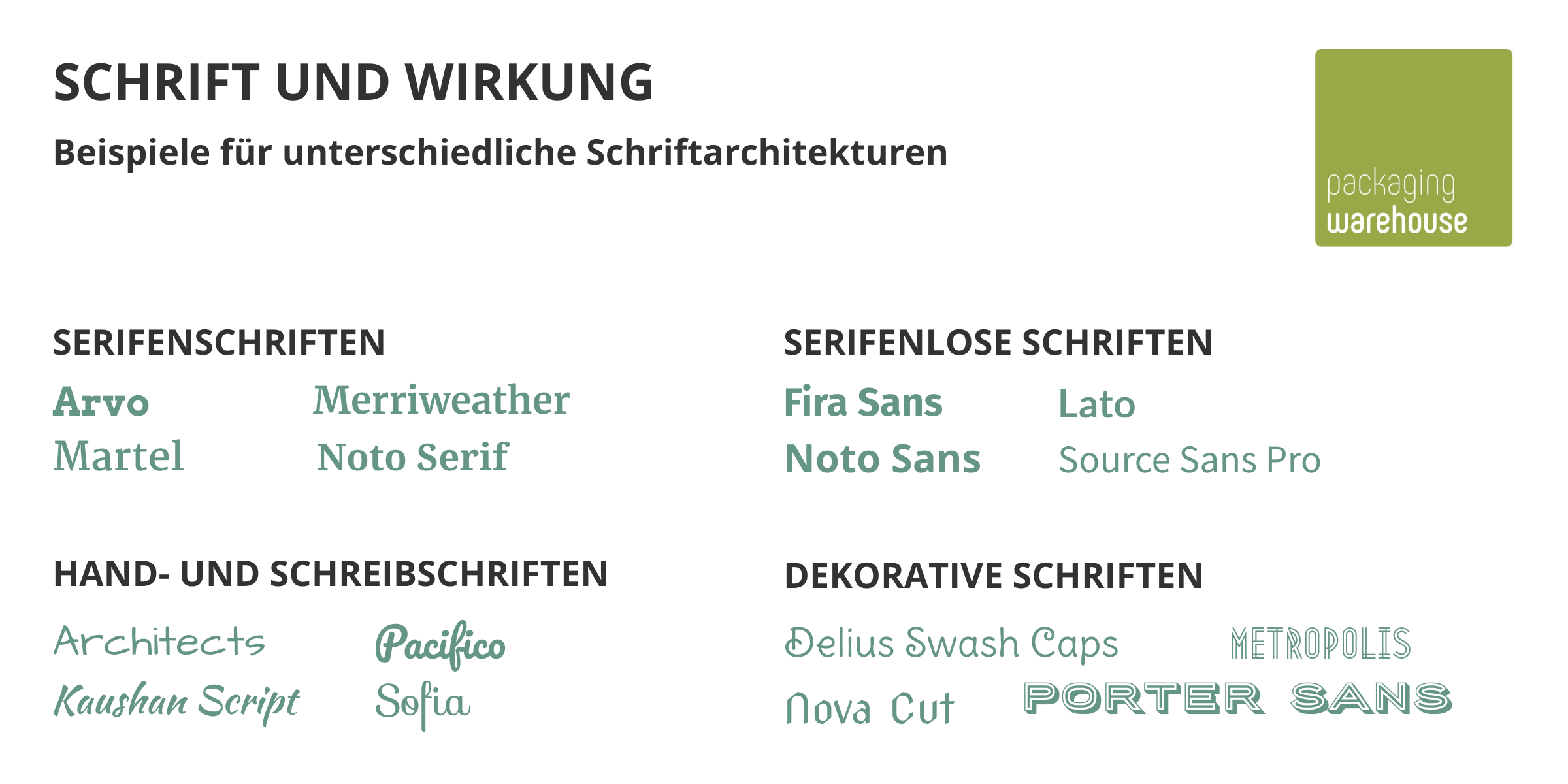
Serif fonts
These fonts are characterized by a small line at the end of a line of a letter - the serif. They are real classics and also convey class. Their effect is therefore high-quality and literary.
Because they are so old and common, their shape is well familiar to our eyes. This makes serif fonts easy to read. For longer text passages and small print, they are therefore a good choice.
Known representatives: Times New Roman
Sans serif fonts
They are known as "Sans Serif", which means nothing more than "without serifs". By eliminating the small feet, these fonts appear modern, clear, businesslike, and clean.
Varying the weight can create even more different impressions: thick Sans Serif fonts look strong and masculine, while thin ones look classy and glamorous.
Known representatives: Helvetica
Writing fonts
As unmistakable as your own handwriting: That's the idea behind handwriting fonts, and that's exactly what they look like.
The result is an incredibly diverse selection, ranging from calligraphic fonts to typography that really tries to imitate handwriting. The main focus here is on an individual, unique typeface - the representative aspect is clearly in the foreground here.
Known representatives: Sacramento
Decorative fonts
Decorative fonts turn letters into real works of art. As a result, they have a particularly strong emotional impact on the viewer, which is why they are used primarily as logo fonts. As secondary text or for continuous text, they are usually too graphic-
These fonts often reflect current trends, and at the same time are used to shape a company's branding for many years to come.
TYPOGRAPHY AS A TOTAL WORK OF ART
Even the different classes of fonts (the German DIN 16518, by the way, distinguishes a total of 11 groups here) have their own characteristic features - and therefore also quite different effects. The design of a typeface should therefore not fit the brand and the product alone. Typography and design only develop their full effect in the overall context. And that consists of:
-
the content (the text),
-
the design (this is the typography) as well as
-
the experience background of your customers.
So it's not a matter of matching your personal taste as closely as possible with a font. You also need to take into account factors such as cultural influences and values, or the personal experiences and expectations of your target audience. But when all the pieces of the puzzle fit together perfectly, the potential of typography is immense: It conveys unspoken and unwritten messages, charges your brand or product with certain associations and characteristics, and guides customers in the direction you want them to go. Enough reasons, then, to look carefully when choosing a font for a new design.

